Brand guidelines exist to answer questions before anyone has to ask them. Every section should earn its place by settling a real decision someone will face: which logo, which color, which font, which words.
Here's what to include, section by section, using Ploverly, a booking app for small studios and one of our example brands, to show what each part looks like in practice.
1. A short introduction
One or two sentences on what the brand does and who it's for. This isn't the place for a mission statement. It's context, so a designer or writer who's never heard of you knows what they're working on.
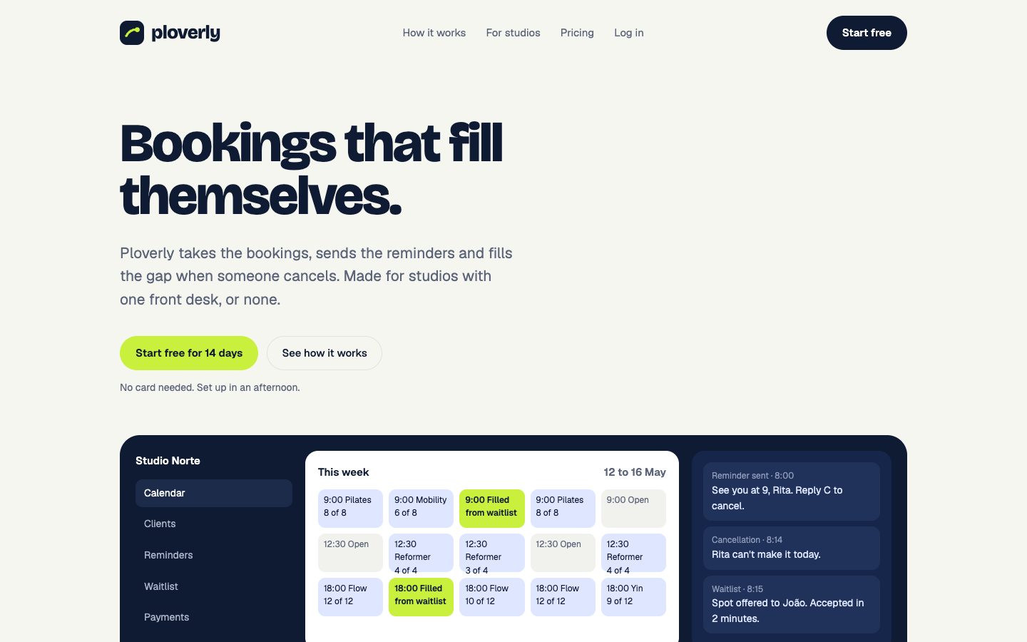
Ploverly's book opens with a line from its own website: "Ploverly takes the bookings, sends the reminders and fills the gap when someone cancels."
2. Logo
The logo section answers three questions:
- Which versions exist? The full logo, the icon on its own, and versions for light and dark backgrounds.
- How much space does it need? Clear space keeps other things from crowding it. A common rule is to keep empty space around the logo at least as tall as the logo itself.
- What should nobody do? Show the mistakes: stretching, rotating, recoloring, adding shadows. A picture of the mistake works better than a sentence.
3. Colors
List every color with its role and its codes:
| Role | What it's for |
|---|---|
| Primary | Main buttons, links and key moments |
| Accent | Highlights and secondary emphasis |
| Background | The page or paper color |
| Text | Body text and headings |
For each color give HEX and RGB for screens and CMYK for print. If you print a lot, add Pantone references too. We explain the codes in HEX vs RGB vs CMYK.
Two extras make a color section far more useful:
- Tints and shades. A scale from very light to very dark for each main color, so designers can make hover states and backgrounds without guessing.
- Contrast pairs. Which text color is readable on which background. Text should reach a contrast ratio of at least 4.5:1 against its background to meet the common accessibility standard (WCAG AA).
4. Typography
Name the heading font and the body font, where to get them, and a size scale: display, headings one to four, body and small text. Include line height and weight for each, because those change the feel as much as the font itself.
Ploverly pairs Bricolage Grotesque, a bold and slightly quirky display face, with Geist for body text. The book shows both at every size.
5. Voice
Most voice sections fail because they're a list of adjectives: friendly, bold, human. Everyone thinks they're all three.
Show real sentences instead. For each trait, give one line the brand would write and one it wouldn't. Ploverly's "Calm and reassuring" trait:
We say: "When someone cancels, the next person gets the spot. You find out after it's sorted."
Not this: "Upon cancellation, the next individual is allocated the vacancy. You are informed after resolution."
There's more on this in brand voice examples.
6. Components
If the brand lives on screens, show the basic interface parts: buttons, inputs and cards, with their colors, corners and sizes. This is where brand guidelines start to overlap with a design system, and it saves your developers a lot of back and forth.
7. Imagery
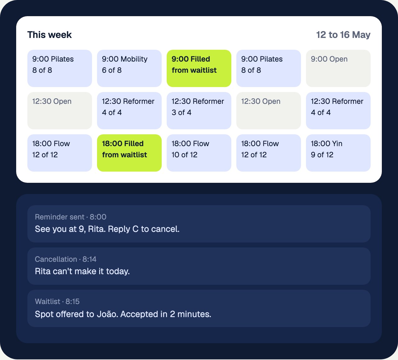
Photo style, illustration style, product shots, patterns. For a software brand like Ploverly, the product screens are the imagery. For a candle maker or a hotel, it's photography.
8. The brand in use
Screenshots of the website on desktop and phone, social posts, packaging, signage. People learn faster from examples than from rules.
9. Ready-made files
The pieces people need every week: LinkedIn and X covers, a profile picture, a business card ready to print, an email signature. Including them in the guidelines means nobody remakes them badly.
10. Design tokens
If you have developers or use AI tools to build, include the same colors, fonts and spacing as code: CSS variables, a Tailwind theme, or a DESIGN.md file. See what DESIGN.md is and how to use it.
What you can leave out
- Long brand stories. A paragraph is plenty. Nobody needs your founding myth to make a flyer.
- Rules nobody will break. If no one would ever put your logo on a tilted angle, you don't need a page about it.
- Every possible layout. Show a few good examples and trust people.
Frequently asked questions
What are the most important parts of brand guidelines?
Logo usage, colors with their codes, fonts with a size scale, and voice. Those four cover most of the decisions people make every day.
How many pages should brand guidelines be?
For a small business, ten to fifteen pages is usually enough. Large companies often run past 50 because they cover more products, regions and formats.
Should brand guidelines include a design system?
If your brand lives on websites or apps, yes, at least the basics: color and type tokens, buttons, inputs and cards. It keeps what designers and developers build in line with the guidelines.
See your own brand as a book.
Paste your website. The scan is free and takes about a minute.