Software brands live almost entirely on screens. Your product is the brand: every button, empty state and onboarding email says something about you. That changes what your brand guidelines need to cover.
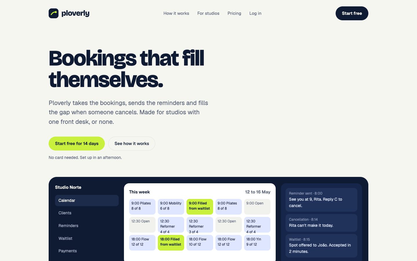
Here's what SaaS brand guidelines should include, using Ploverly, a booking and reminder app for small studios and one of our example brands.
What's different about SaaS brands
A bakery's brand shows up on a sign, a box and an Instagram feed. A software brand shows up in thousands of interface states that designers and developers build every week. So SaaS guidelines need to:
- Work at interface sizes. Your logo has to read as a 32-pixel app icon and a browser tab favicon, not just on a billboard.
- Cover states, not just colors. Hover, focus, disabled, error, success.
- Speak to developers. Colors and fonts as code, not just swatches.
- Include product writing. Buttons, error messages and emails are brand voice too.
Color for interfaces
Ploverly's palette is small and strict:
| Role | Color | Used for |
|---|---|---|
| Primary | Navy #0F1B33 | Text, main buttons, the app's frame |
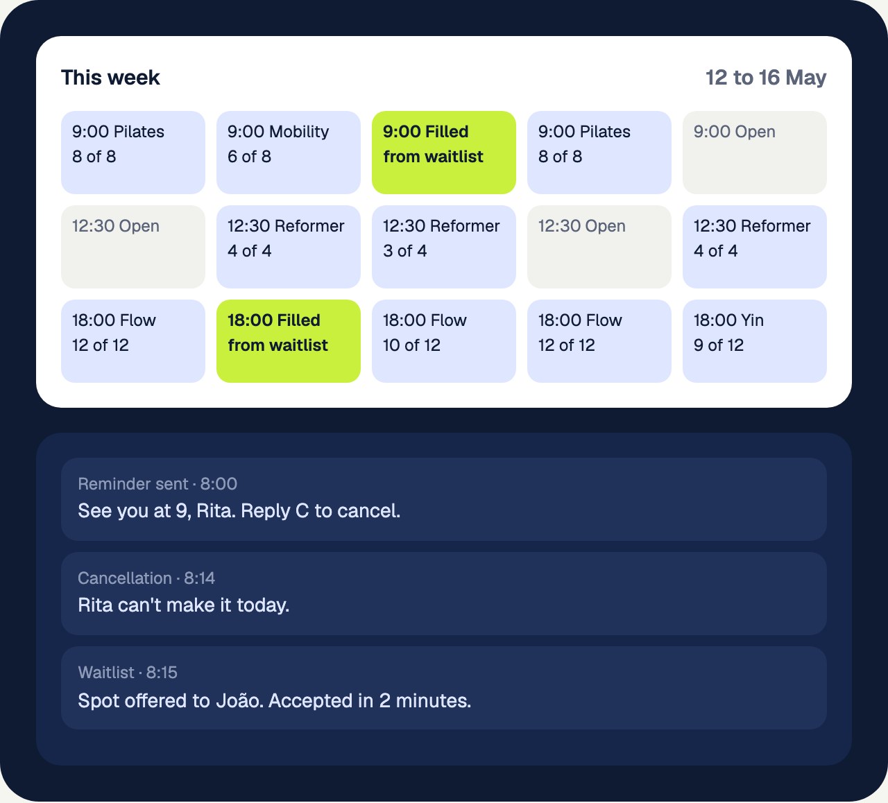
| Accent | Lime #C8F03C | The moments that matter: filled spots, the main sign-up button |
| Background | Off-white #F6F6F1 | Pages and panels |
The lime works because it's rare. If everything is lime, nothing stands out. SaaS guidelines should say exactly where the accent is allowed.
Beyond the core colors, a software brand needs status colors for success, warning and errors, and scales for each main color, from very light to very dark, so designers can build hover states and backgrounds without picking new shades. Check every text color against its background: at least 4.5:1 contrast for normal text.
Type that survives small sizes
Ploverly pairs Bricolage Grotesque, a bold headline font with character, with Geist, a clean font built for interfaces. That's a common SaaS pattern: personality in the headlines, clarity everywhere else.
Your guidelines should give a full size scale with line heights, because interface text runs from 12-pixel labels to 70-pixel headlines.
Components
This is where SaaS guidelines overlap with a design system. At minimum, show:
- Buttons: primary, secondary and text-only, with their colors, corners and sizes.
- Inputs: fields, focus rings and error states.
- Cards: background, border, corner radius and padding.
Ploverly's buttons are fully rounded pills. That one decision shows up on every screen, so it belongs in the guidelines.
Voice in the product
Marketing pages get the attention, but most of your writing lives inside the product. Ploverly's voice traits come from its own site:
Plainspoken. "Less time on the phone. More people in the room."
Calm and reassuring. "When someone cancels, the next person gets the spot. You find out after it's sorted."
Good SaaS guidelines add a few product-writing rules: say what happened and what to do next, name the button after the action ("Save changes", not "OK"), and never blame the user in error messages.
Tokens for developers and AI tools
Developers shouldn't copy hex codes from a PDF. Give them the brand as code: CSS variables, a Tailwind theme, design tokens in JSON. Teams building with AI tools can add a DESIGN.md file so Claude, Cursor or Lovable use the right colors and fonts from the first prompt. See DESIGN.md: what it is and how to use it.
Screens as imagery
For a SaaS brand, product screenshots are the main imagery. Your guidelines should show the product on desktop and phone, and set rules for screenshots in marketing: which screens, which data, how they're cropped.
A SaaS brand guidelines checklist
- Logo, including app icon and favicon sizes
- Colors with roles, scales, status colors and contrast pairs
- Heading and body fonts with a full size scale
- Buttons, inputs and cards
- Voice traits, plus product-writing rules
- Product screenshots on desktop and phone
- Social covers, profile picture and email signature
- Tokens as CSS, Tailwind, JSON and DESIGN.md
Frequently asked questions
What should SaaS brand guidelines include?
Logo usage at small sizes, a color palette with roles and interface states, fonts with a full size scale, basic components like buttons and inputs, voice for product writing, and the brand as code for developers.
How are SaaS brand guidelines different from a design system?
Brand guidelines describe the brand as a whole, including voice and marketing. A design system turns the visual parts into reusable code and components. SaaS companies usually need both, and the best guidelines link the two.
Do startups need brand guidelines?
Yes, often earlier than they think. Startups have many people and tools building screens quickly, and without shared rules the product drifts in a few months.
See your own brand as a book.
Paste your website. The scan is free and takes about a minute.