Most advice on brand colors starts with color psychology: blue means trust, red means energy. It's not very useful, because every bank is blue and every brand wants trust. What actually makes a palette work is simpler: a small number of colors, each with a clear job, that read well together.
Start with roles, not shades
Before picking colors, decide which jobs you need filled. Almost every brand needs these four:
| Role | Job |
|---|---|
| Primary | The main brand color, for buttons, links and key moments |
| Background | The page or paper color |
| Text | Body text and headings |
| Accent | A second color for highlights, used sparingly |
Then pick a color for each role. Here are our three example brands:
| Brand | Primary | Background | Text | Accent |
|---|---|---|---|---|
| Ploverly (software) | Navy #0F1B33 | #F6F6F1 | Navy | Lime #C8F03C |
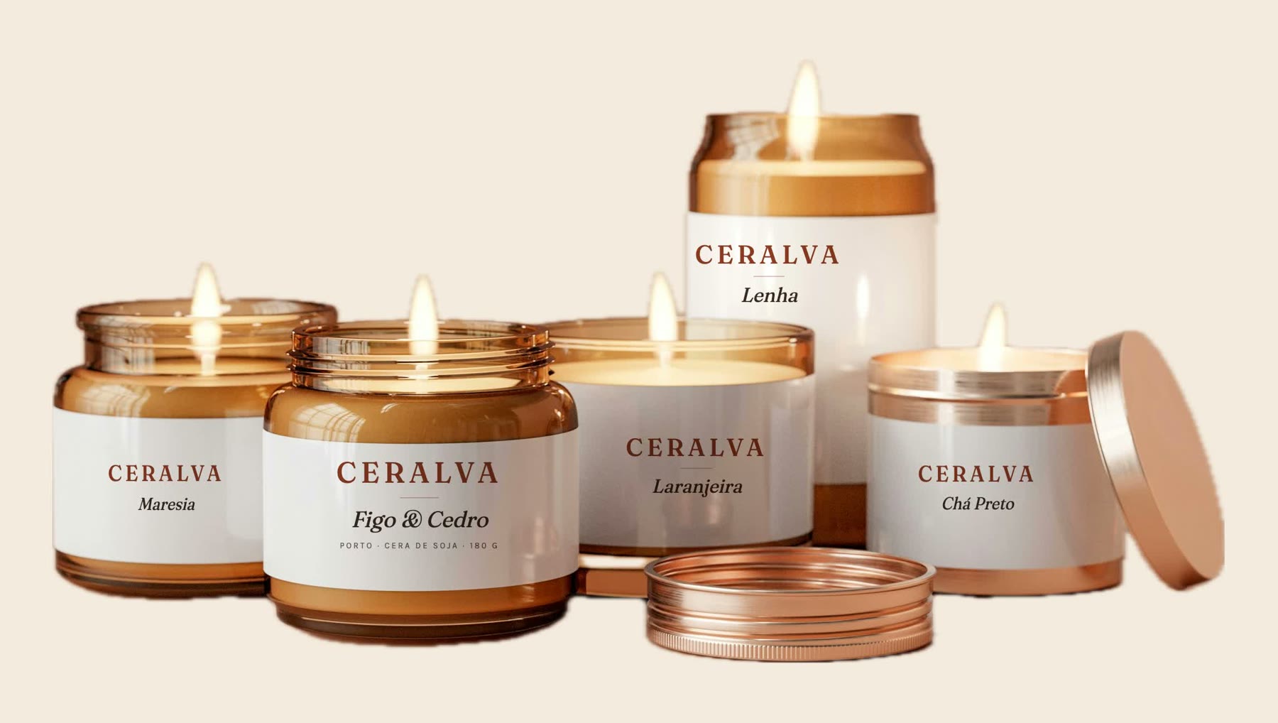
| Ceralva (candles) | Terracotta #A8482A | Cream #F3EBDD | #2B211C | Sage #7C8466 |
| Encosta Lenta (guesthouse) | Wine #5E1F2B | Stone #F2EEE7 | Wine | Schist #3F3E3B |
Notice that none of them uses pure white or pure black. Slightly warm or cool off-whites and near-blacks make a palette feel designed rather than default.
Pick a primary color that's yours
Your primary color will be on every button and every banner, so pick one that's distinct in your market. Look at your closest competitors first. If they're all blue, a deep green or a warm red will set you apart before anyone reads a word.
Good primaries tend to be strong enough for white text to sit on them. That makes buttons easy.
Check contrast early
A color that looks great as a swatch can be unreadable as text. The common standard (WCAG AA) asks for a contrast ratio of at least 4.5:1 for normal text and 3:1 for large text.
Check:
- Text color on background.
- Button text on your primary color.
- Accent color on background, if you'll ever use it for text.
Ceralva's text on its cream background reaches 13.3:1, and white on terracotta reaches 5.8:1, so both pass. Lime on off-white, Ploverly's accent, would fail as text, which is why the brand uses it as a fill behind dark text instead.
Build scales
One shade per color isn't enough for real design work. You'll need a light tint for backgrounds, a darker shade for hover states, a mid tone for borders. A scale of 11 steps, from 50 (lightest) to 950 (darkest), gives designers room without inventing colors.
Keep it small
Three to five colors is plenty. Every extra color is another way to be inconsistent. If you need more variety, use tints of the colors you already have.
Get the codes right
Write every color in HEX and RGB for screens and CMYK for print, plus Pantone if you print a lot. Converting between them isn't exact, so ask your printer for a proof before big print runs. See HEX vs RGB vs CMYK.
See a palette in a real book
Ceralva's palette comes from what it sells: terracotta like clay pots, sage like dried herbs, cream like soy wax. Open the book to see the colors with their codes, scales and contrast checks.
Already have a website?
Then you already have brand colors, even if nobody wrote them down. They're in your site's code. Identitas reads them, figures out which is the primary, the background, the text and the accent, and builds the scales and contrast checks for you.
Frequently asked questions
How many brand colors should I have?
Three to five is enough for most brands: a primary, a background, a text color and one or two accents. More than that gets hard to use consistently.
How do I choose a primary brand color?
Look at what your competitors use, then choose something distinct that suits your business and is strong enough to carry white text on buttons.
What contrast ratio should brand colors have?
Body text should reach at least 4.5:1 against its background, and large text at least 3:1, to meet the WCAG AA accessibility standard.
See your own brand as a book.
Paste your website. The scan is free and takes about a minute.